HA!
I'm afraid that didn't happen, but I'm here today to resurrect my (also long neglected) "Five on Friday" theme and hereby present to you:
Five Fonts I Like to Hand-Cut

This is the same font as the Banana Frog stamps from the aforementioned page and it's great to print out directly onto your card or patterned paper. There are no fiddly middle holes of letters to worry about so it's easy peasy to do.

This also comes with a bold version that is the inverse i.e. coloured dots on a clear letter (with a coloured outline). Upper case only and you could just cut around the outside edges and leave the "holes" in place on letters like A B D O P Q R and even G.
The next three fonts can be printed out onto the front of your card or paper, but I tend to reverse them using my printer settings (or flipping them if they are in a suitable word processing package) and print them on the back of the paper or card, preferably in draft or outline mode to save on ink.
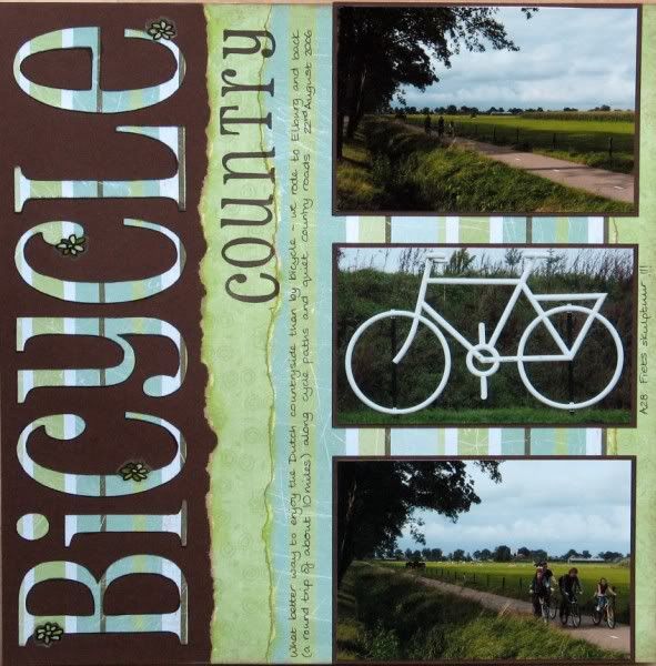
This uni-case font is a pretty close match to the one used by Basic Grey for many of their alpha stickers - great for adding a monogram to match.
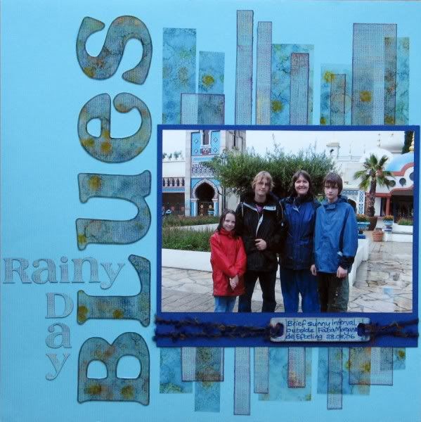

I love the flicks and curves on this font, but it's easier to cut if you choose upper case letters only. I'm told that cutting with a craft knife on a glass mat is the best way to cope with the more difficult fonts, but I generally manage with a combination of my Fiskars fingerblade on a normal cutting mat and the occasional use of curved detail scissors. Slow and steady wins the race - and if you snip a tiny bit too much off you can always reprint or stick a flower over the join (see below)!

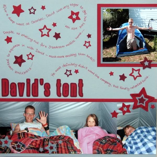
I have the Banana Frog stamps to match this one too. The vowels come in upper and lower case variants with the rest of the letters being a mix of both. Cutting it out is a bit of a labour of love to be honest, but I do love it so I'm happy to labour! Make your title BIG & BOLD & SHORT to minimise your pain!
Do you like to hand-cut your titles? What fonts would you recommend?
11 comments:
I used to do this a lot when I first started scrapping - it's a good reminder today that simple, basic and cheap still works perfectly.
Honestly, I never even think of hand cutting, maybe I will on an upcoming layout. (shhhh I don't even always have a title :::gasp:::) I still tend to use a computer font and double mat it. From time to time I have that same envy but just can't justify all that money for the machine then more money for the fonts. I have thousands of awesome fonts on my computer.
I don't think I've ever cut a title....but what a good idea....I'd be quite happy to sit cutting while watching TV....and as I only have a few sizzix alphabets...it would certainly give some variety.
I am not a hand-cutting fan (don't have the patience) but have a good friend who is so good with an exacto that we used to call her the "human silhouette."
I have pharmacy in stamps!
Rinda
Although I have not handcut a title, I am the queen of alphabet stamps.
I have them in every size and loan them out at crops to my other fellow crafters.
I have a confession to make...I do own a cricut and several yummy cartridges and I have never used it...oh my!!!
It is my goal in 2012 to learn just how to use it and let it cut my titles.
thanks Jemma that steelfish one looks a really useful one so I've downloaded it
Haven't handcut for a LONG time! I use my Silhouette or Alpha stickers...but I DO like the fonts, TFS!
Alison xx
I do a lot of cutting out - often to add a bit of oommphh to a flat letter sticker. I don't use my alpha stamps much - but love the look of the steelfish, I never realised you could download it so thanks! I love the big titles you use so maybe I'll be following suit :)
I so admire your patience! I'd never handcut a title in a month of Sundays... Lovely to see how beautifully they work!
these are great fonts thanks for sharing your creative genius :)
Love Pharmacy, have both BF stamp sets, and now the digi font too thanks for the link :)
Post a Comment